The Story Behind the Solution
The Problem of Too Many Alerts and Too Much Confusion
Imagine an IT security team at one of Remotely's clients, responsible for hundreds of remote team members and their endpoints. They were getting hundreds of alarms every day, most of them fake or unclear. That's what Remotely's old security system was like for their client's IT people. They were getting too many alerts and the system was hard to understand. It was a mess of information, making it really hard for them to effectively 'see, secure, and support' their team members and spot the real security threats quickly. This meant they were slower to fix problems, and the client's overall security posture wasn't as strong as it should be, increasing Technical Risk.

Frustrated Users
(UX Risk)
IT people felt swamped and stressed trying to figure out what was important.
Slow Security Fixes
(Technical & Financial Risk)
Real dangers might get missed or take too long to fix, which could lead to hacks or data leaks for the clients.
Unhappy Customers
(Financial & UX Risk)
If Remotely's clients found the system hard to use, they might stop using the software and look for other security tools, impacting Remotely's revenue.
My Job
Lead UX/UI Designer
My Team
1 Project Leader, 2 Programmers, 1 Quality Checker
Methodology
The project was executed using an Agile methodology , with a focus on two-week sprints to ensure continuous delivery and close collaboration with the development team.
What I Was Responsible For
- Finding Out What Users Needed
- Planning Out Ideas
- Designing the Solution
- Testing with Real Users
- Making It Better
- Getting Ready for Programmers
- Working with the Team
My Design Process
To transform a complex system into an intuitive, efficient tool, I followed a structured, user-centered process. Every phase, from initial research to final handoff, was focused on understanding user needs and creating a measurable impact.
- Finding Out the Facts by Talking to Users
-
To really understand the mess with too many alerts and the challenges of managing risk for remote teams, I first had to dig deep. I talked to the IT professionals who used Remotely's system every day at client sites.
Interviews
I sat down with 6 IT administrators and security experts from various client organizations. I asked them about their daily tasks, what bothered them about the old system, and what they really needed to effectively mitigate risk.
Surveys
I sent out quick questions to more users (50+) to see if what I heard in interviews was true for everyone, especially regarding alert fatigue and data overload.
Looking at Competitors
I checked out other security and RMM systems in the market to see what they did well and what we could learn to better serve Remotely's clients and their unique security challenges for remote workforces.
What I Found Out
(The Main Problems - directly impacting Risk Mitigation)
My research consistently showed that IT people at Remotely's client organizations faced big problems that hindered effective risk management
Pain point 1
“ Difficulty finding relevant information. “
To address this pain point, the design will prioritize clear information hierarchy, intuitive navigation, and powerful search functionality. By organizing information effectively and providing easy access to relevant data, users can quickly find what they need.
Pain point 2
“ Overwhelming amount
of data “To mitigate this issue, the design will focus on data visualization techniques that present complex information in a digestible and actionable manner. By using clear graphs, charts, and other visual elements, users can easily understand and interpret data.
Pain point 3
“ Lack of clear visual cues “
To improve visual clarity and help users prioritize information, the design will incorporate strong visual cues, such as color coding, icons, and meaningful labels. These cues will guide users towards critical information and reduce cognitive load.
Pain point 4
“ Time-consuming tasks “
To streamline workflows and reduce the time required for common tasks, the design will focus on automation and efficiency. By automating repetitive tasks and providing shortcuts, users can save time and focus on more strategic activities.
These core pain points formed the foundation of our design strategy, guiding every subsequent decision to directly address user frustrations and enhance Remotely's value as a Risk Mitigation and Management solution.
- Planning the Solution for the User
-
Knowing the problems, I then thought about who we were designing for (the IT administrators at client companies) and how they'd use the new system to 'see, secure, and support' their remote team members.

User Persona
To keep users in mind, I created Sarah John. She's a 28-year-old Security Analyst working for one of Remotely's clients. Her hopes (like 'fixing security issues fast') and daily frustrations (like 'too many alerts' that lead to UX Risk) guided every design choice I made to improve their ability to manage Technical Risk.
How Sarah Helped My Design
Sarah's frustrations with 'high volume of security alerts' and 'spending excessive time on manual tasks' (directly observed in our user research) became the primary drivers for our focus on a simplified dashboard and automated workflows in the redesign. Her need to 'quickly identify and respond to security incidents' pushed me to make workflows simpler and even automate some tasks, directly addressing UX Risk (productivity) and improving Technical Risk mitigation.
User Journey Map: Seeing the Whole Story
I drew out Sarah's entire journey with the system, from setting it up for the first time at her client company to using it every day to manage their remote endpoints. This helped me see exactly where she got stuck and where we could make things much smoother, specifically identifying opportunities for better Risk Mitigation and Management at each stage.
Stage Action Feelings & Thoughts Pain Points Opportunities Onboarding & Configuration
- Access Admin Console
- Create account & 2FA setup
- Deploy agents
- Resolve initial setup issues
- Configure basic policies
- Excited, Apprehensive 🙂
- Frustration with roadblocks 🙁
- Satisfaction with completion 🙂
- Complex initial setup
- Integration challenges
- Streamlined onboarding wizard
- Proactive support
Daily Usage & Monitoring
- Review security posture overview
- Investigate high-severity alerts
- Isolate affected devices
- Respond to incidents
- Generate reports
- Concern with critical alerts 😟
- Satisfaction with threat response 🙂
- Frustration with alert fatigue 🙁
- Alert overload
- Time-consuming investigations
- Improved alert prioritization
- Automated response workflows
- Clearer alert visualizations
Ongoing Management & Optimization
- Update security policies
- Review and adjust configurations
- Generate reports for stakeholders
- Stay updated on security threats
- Participate in training
- Confidence in platform effectiveness 🙂
- Appreciation for improved security posture 🙂
- Keeping up with evolving threats
- Lack of proactive guidance
- Regular security updates
- Personalized recommendations
- Continuous learning opportunities
Loyalty & Advocacy
- Renew subscription
- Recommend Remotely to colleagues
- Participate in the community
- Provide feedback to Remotely
- Confidence in Remotely's value 🙂
- Trust in the platform's effectiveness 🙂
- Potential for feature fatigue
- Lack of loyalty incentives
- Exclusive benefits
- Community engagement
- Loyalty programs
What I Learned from Sarah's Journey
The journey map vividly illustrated significant user drop-off and frustration during the Onboarding & Configuration phase due to complexity (a form of UX Risk), and chronic inefficiency during Daily Usage & Monitoring due to the constant struggle with alert volume (impacting Technical Risk management). These 'Pain Points' identified at each stage directly reinforced our core research findings and highlighted the most impactful areas for design intervention, informing how Remotely could truly help its clients 'see, secure, and support' their remote teams.
- Designing It From Sketches to a Working System
-
With a clear picture of the users and their problems, I started building the new design aimed at enhancing Remotely's Risk Mitigation and Management capabilities.
The Wireframes
To create effective wireframes , I focused on user-centered design, clarity, functionality, and visual hierarchy. Prioritize elements like a dashboard, alerts, data analysis tools, collaboration, and customization. Iterate and test to ensure the wireframes meet users needs and improve the Remotely platform.
My Decisions from Wireframing
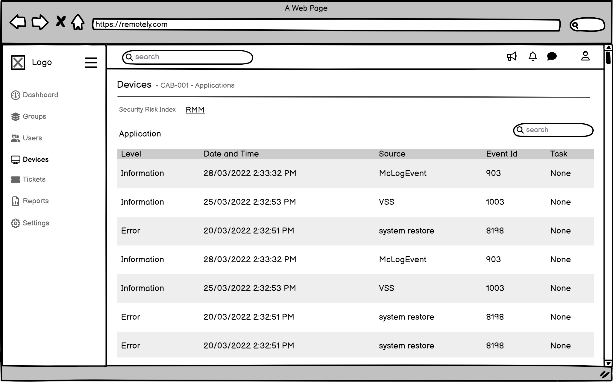
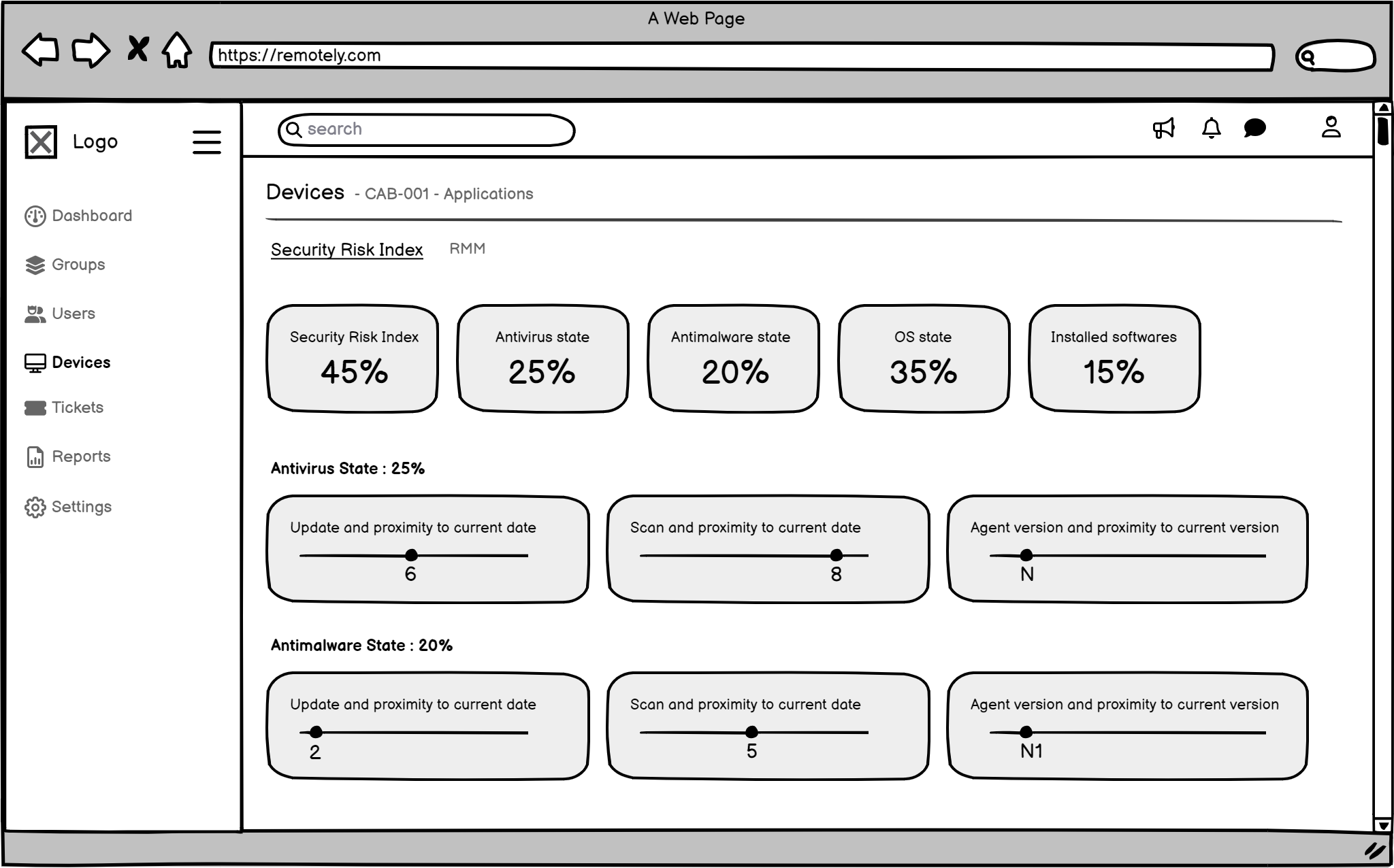
I decided on a main dashboard that users could customize, allowing them to prioritize relevant risk data. It would have special sections for critical alerts, making it easier to find what's important right away and accelerating Technical Risk response. The navigation was simplified too, directly addressing the 'Difficulty Finding Relevant Information' pain point.
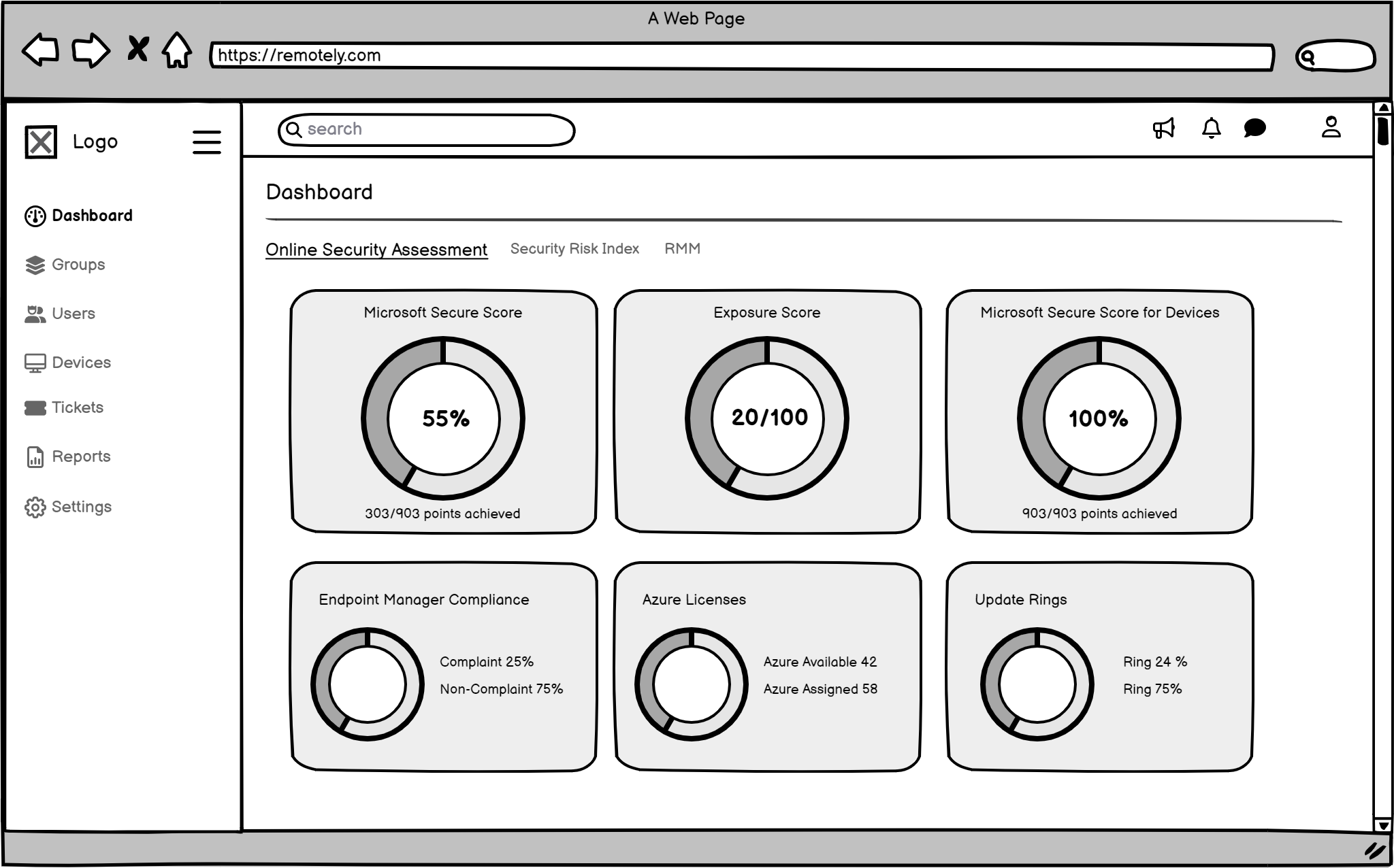
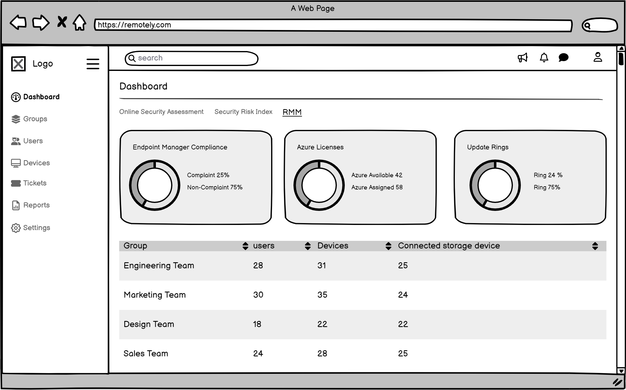
The Final Look (High-Fidelity UI Design): Seeing the Solution!
Then, I created the final, polished designs. I chose every color, font, and button carefully to make sure the system was easy to use, clear, and looked good. Every part of the design was made to solve a specific user problem and facilitate more effective Risk Mitigation and Management for Remotely's clients.
- Testing and Making It Better by Learning from Users
-
make sure my design was truly effective for Risk Mitigation and Management for Remotely's clients, I did two rounds of testing where real IT administrators from client organisations tried using my clickable prototype. I watched them, asked questions, and took notes.
Who Tested
Participant Profile

Sarah Jones
Age: 28
Gender: Female
Occupation: Security Analyst
Company Size: Medium-sized company (500-1000 employees)
Device/Platform: Windows 11 Laptop
Testing Method: Figma Prototype Testing
What I Looked For
Test Objectives
- Evaluate the usability and intuitiveness of the alert dashboard navigation and filtering options.
- Assess the ease of use and understandability of the policy configuration interface.
- Explore the user's experience and satisfaction with the visual representation of security data and reports.
- Simulate a security incident scenario and evaluate the user's ability to navigate the proposed response workflows within the prototype.
- Gather user feedback on the overall design aesthetic and its suitability for a security-focused application.
What I Found & How I Fixed It
The tests revealed valuable insights, confirming many initial hypotheses while also uncovering areas for further refinement. The table below summarizes key findings and our corresponding design recommendations, directly impacting how users manage Technical Risk and experience the platform (UX Risk)
Task# Task Description Success Time on Task Errors/Issues Encountered Severity Recommendations 1 Navigate the alert dashboard and attempt to filter alerts by severity (e.g., high, medium, low). Partial 2 min 30 sec Difficulty finding the specific filtering options. Required assistance from the facilitator. Medium Improve the visibility and discoverability of filtering options on the alert dashboard. Consider using a more prominent UI element. 2 Investigate a simulated "Phishing Attack" alert within the prototype. Partial 4 min 15 sec Unable to access detailed device information related to the alert. High Implement functionality to display detailed device information (e.g., device name, user location, OS version) within the alert details. 3 Attempt to configure a new policy to block access to social media sites during work hours. Partial 5 min 45 sec Difficulty understanding the logic behind certain policy settings. Required clarification from the facilitator. Medium Enhance tooltips and provide more context for policy settings. Consider providing visual examples of policy configurations. 4 Explore the available reports (prototypes) and attempt to identify any potential trends or anomalies. Yes 3 min 15 sec Positively received the visual representation of security data. Suggested the inclusion of interactive charts and graphs. Low Explore the feasibility of incorporating interactive data visualizations within the reports. 5 Provide overall feedback on the design aesthetic and usability of the prototype. Yes 2 minutes Generally positive feedback on the overall design aesthetic. Suggested improvements to the color palette and font choices for better readability. Low Revise the color palette and font choices to enhance readability and visual appeal. -
Problem: Users initially struggled with the discoverability and functionality of specific filtering options on the alert dashboard (Task 1, Medium Severity). This directly linked to our 'Difficulty finding relevant information' pain point, crucial for effective Risk Mitigation.
-
My Fix: I redesigned the filter placement to be more prominent, integrated clear textual labels alongside icons, and implemented a 'Save Filter Preset' feature to reduce repetitive actions, improving efficiency and reducing UX Risk (productivity loss).
Based on these findings, we swiftly iterated on the design. For example:
The usability findings validated that our initial design direction was strong, particularly in improving data visualization (as seen in Task 4's positive feedback). Users responded very positively to the new visual clarity and intuitive workflows, particularly the improved alert prioritization and data visualization, signifying a reduction in their UX Risk related to platform use.
- Handing It Over to Make It Easy for Programmers
-
To make sure the programmers could build the system exactly as I designed it, and to keep everything consistent for future updates (crucial for a secure and flexible platform like Remotely's), I created a clear guide of all the design parts (like a recipe book for designers and programmers).
What My Guide Included
-
Colours: Exact colour codes for everything, ensuring visual consistency in the security interface.
-
Fonts: Which fonts to use and how big they should be, for readability of critical security data.
-
Icons: All the symbols and how to use them, providing clear visual cues for various risk statuses.
-
Layout: How everything should be spaced out on the screen, for optimal information hierarchy in a dashboard.
-
Buttons & Forms: How all the buttons, input boxes, and other parts should look and behave (e.g., what a button looks like when you hover over it), ensuring a consistent and predictable user experience for managing security tasks.


-
What I Learned & What's Next
This project was a profound learning experience, reinforcing several key principles
The Power of Quantified Problems
Understanding the business and user impact of problems provides immense leverage for design solutions, especially in a B2B context.
Iterative Testing is Non-Negotiable
Even seemingly small usability issues can have a disproportionate impact on complex workflows in enterprise solutions. Continuous testing and iteration are crucial for refining solutions that serve diverse client needs.
Bridging Design & Development
A robust design system and clear handoff documentation are invaluable for ensuring design integrity through implementation and fostering strong collaboration with engineers.
If I had more time or this project continued, I would think about
Allowing users (IT administrators) to personalize their dashboards even more, so they only see what's most important to their specific client environment.
Thanks for watching
For more information or to discuss potential projects, please don't hesitate to reach out. I'm available to answer any questions you may have and explore opportunities to collaborate.