What I Did & The Big Impact
I Helped Remotely Make Security Easier: Users Onboarded 20% Faster, Alert Response Improved by 15%
My Job
Lead UX/UI Designer
What I Did
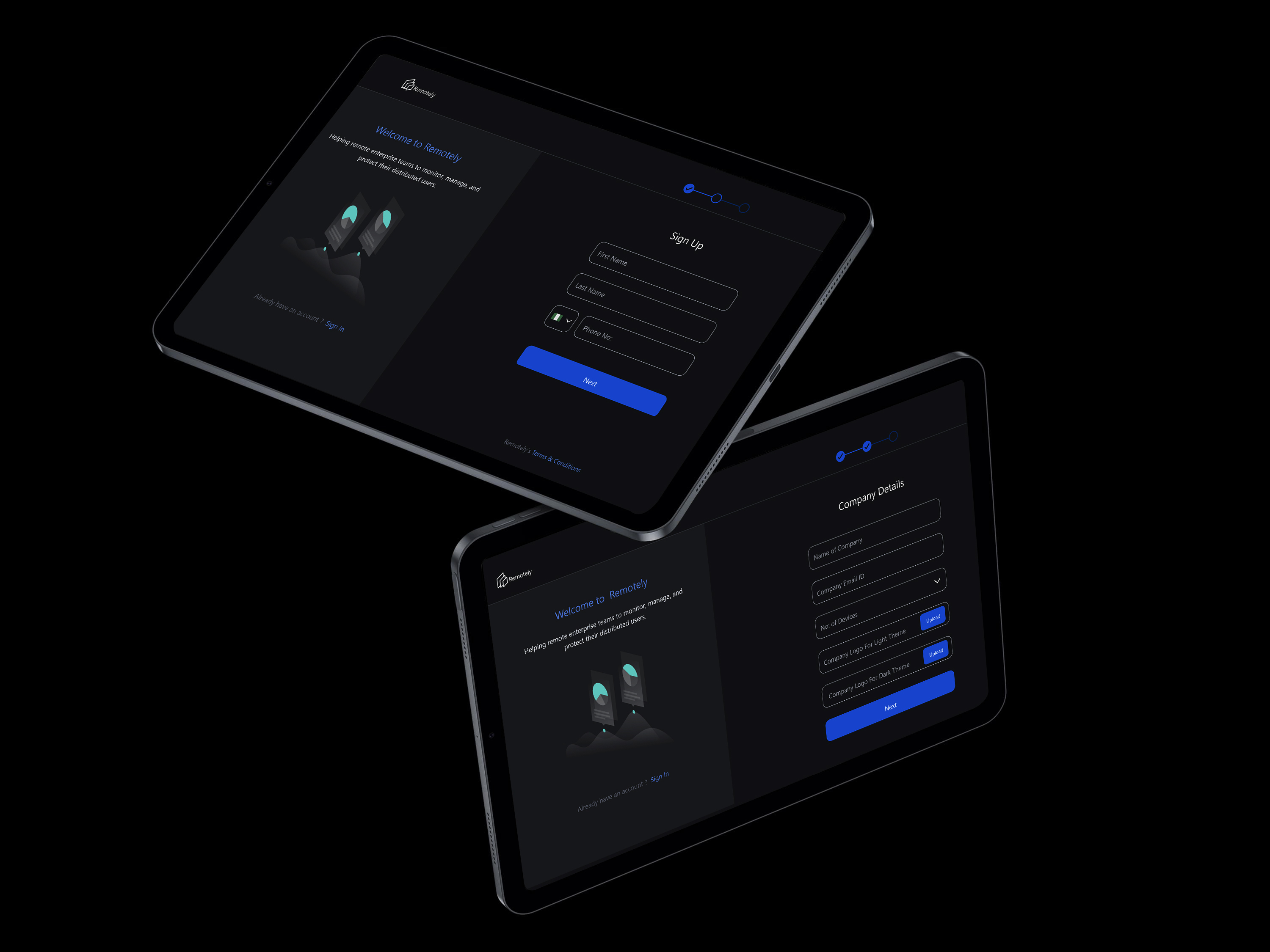
I led the end-to-end redesign of the Remotely, B2B SaaS application.
How Long
3 Months
Tools I Used
Figma, FigJam, Balsamiq
quick story
I completely redesigned Remotely's security system. Remotely sells its innovative Risk Mitigation and Management (RMM) software to various enterprise clients who rely on it to manage their IT security, particularly for remote team members and their endpoints. The old system was confusing and generated too many alerts, causing significant UX Risk (productivity loss) for these client IT teams. My new design makes things clear and easy to use. This made users learn faster and respond to security issues more quickly, directly contributing to improved Technical Risk management. We proved this worked by measuring onboarding time, alert response speed, and user satisfaction after launch.
The Results of How My Design Made a Real Difference
My redesigned security system didn't just look better; it made a real, positive difference for IT administrators at Remotely's client organizations, and for Remotely as a software vendor. It changed a complex system into an intuitive, efficient tool for IT administrators.
The Numbers Prove It
The redesign yielded measurable positive results, demonstrating the direct business value of user-centered design:
The new dashboard is much more intuitive and helps me identify potential security threats more quickly.
Sarah - Security Analyst from a Remotely client organization
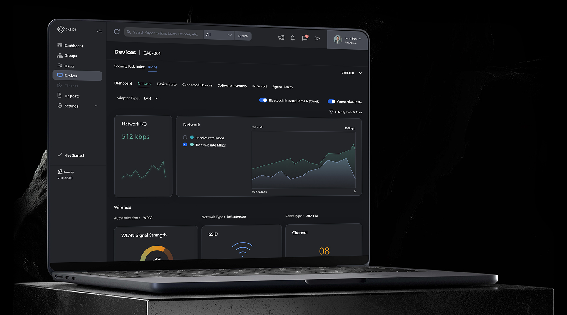
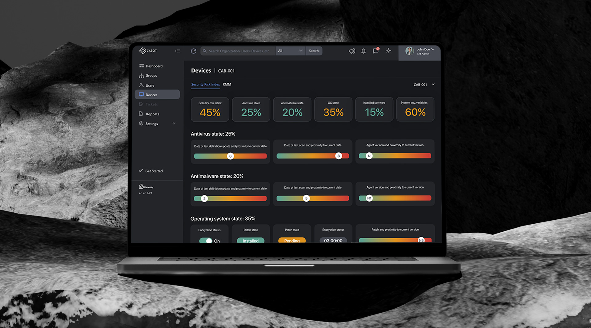
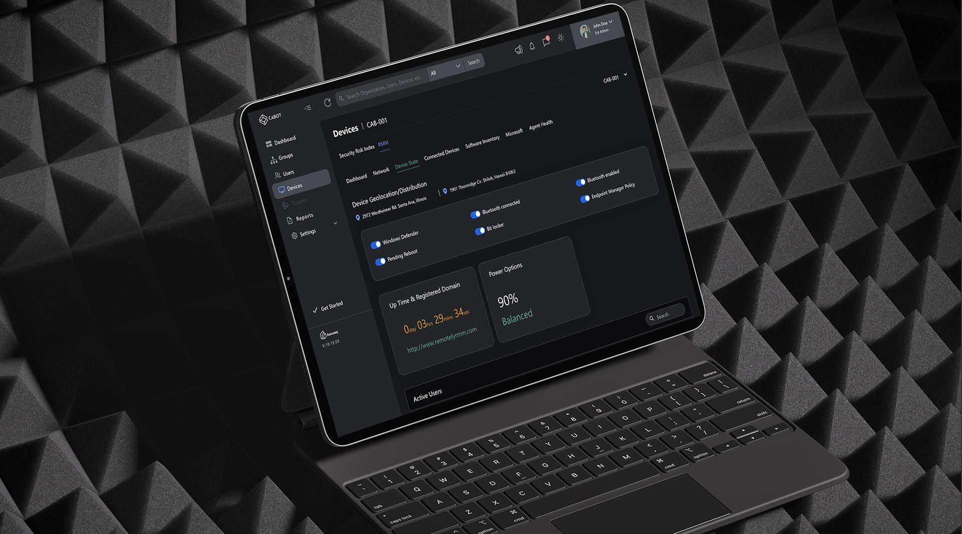
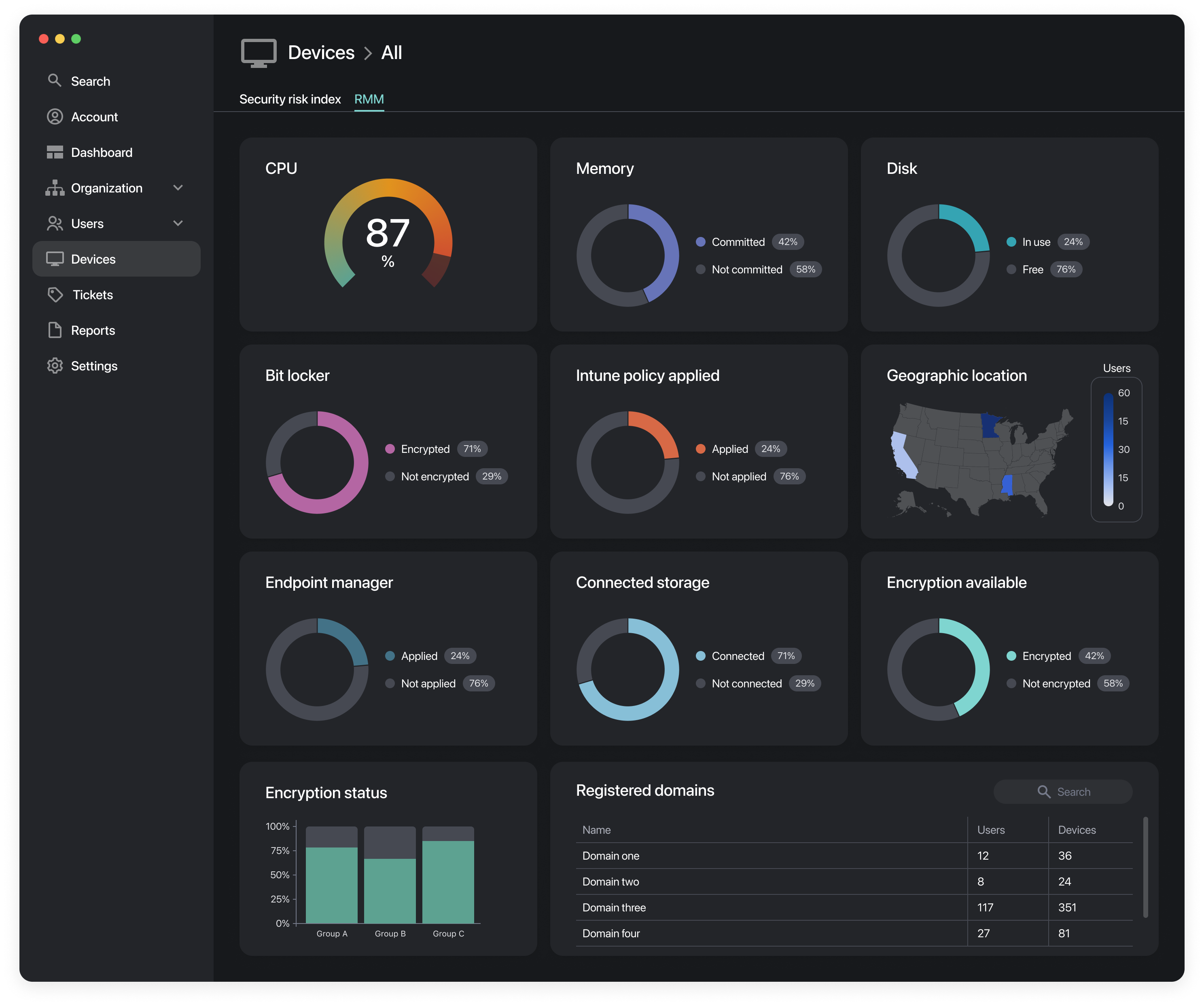
Data visualization
The design will focus on data visualization techniques that present complex information in a digestible and actionable manner. By using clear graphs, charts, and other visual elements, users can easily understand and interpret data.
Clarity Improved
To improve visual clarity and help users prioritize information, the design will incorporate strong visual cues, such as color coding, icons, and meaningful labels. These cues will guide users towards critical information and reduce cognitive load.
What Users Said
The new dashboard is much more intuitive and helps me identify potential security threats more quickly.
This feedback confirms that the redesign not only improved efficiency but also significantly enhanced user confidence and satisfaction, translating directly into better client retention for Remotely.