The Story Behind the Solution
The Problem of Fragmented Care and Information Overload
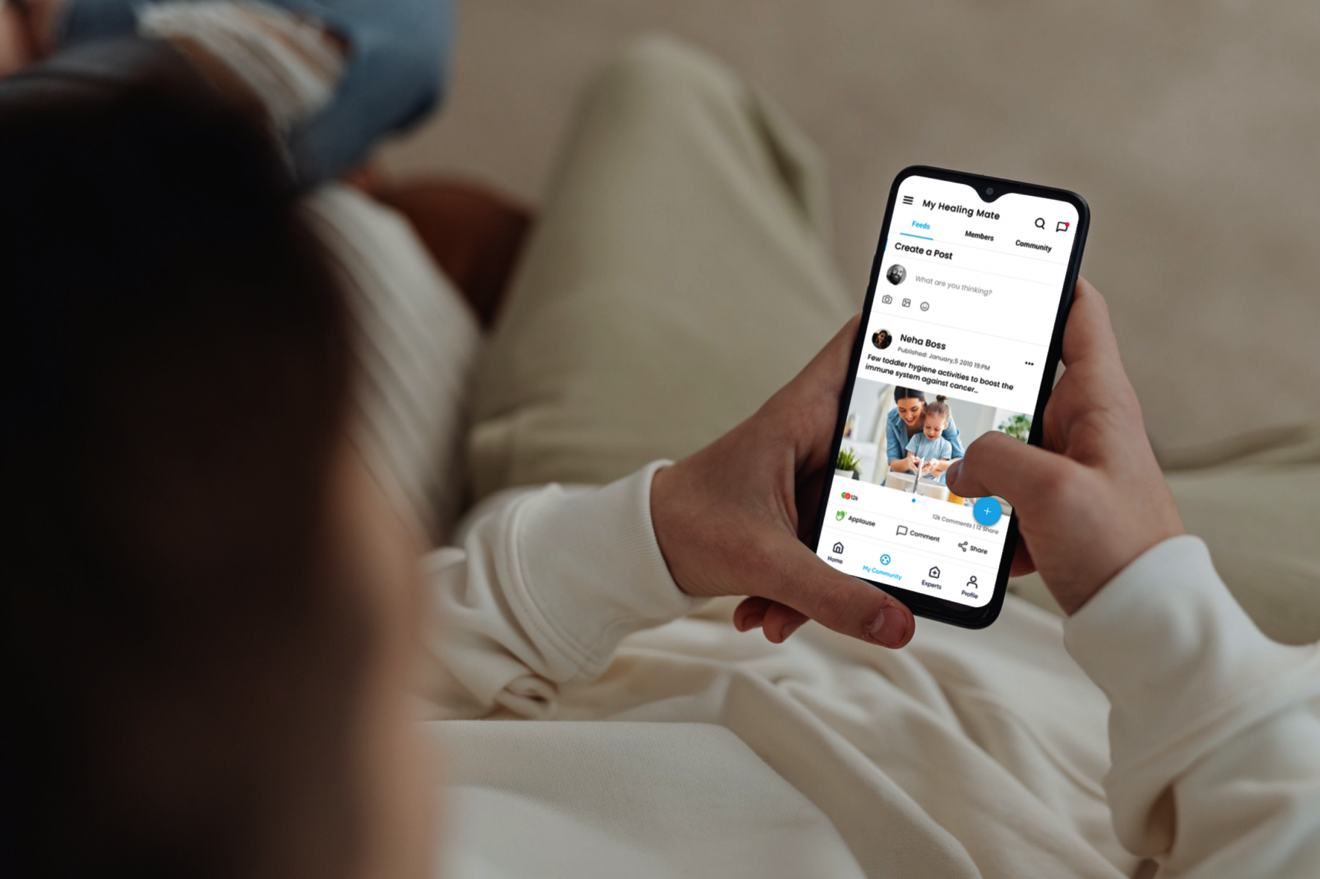
Imagine a patient and their family, overwhelmed by a new cancer diagnosis, trying to navigate a fragmented healthcare system. They're getting information from multiple doctors, a variety of websites, and different support groups—every source is a silo. This led to confusion and emotional stress. The My Healing Mate platform was designed to solve this by creating a single, trusted source of support.
Frustrated Patients
Patients felt swamped and stressed trying to find reliable information and connect with others who understood their situation.
Siloed Communication
Oncologists and care specialists struggled to coordinate care efficiently, often missing key details or having to manually consolidate information from different sources.
Emotional and Physical Burden
The lack of a unified support system and clear information increased the emotional and physical burden on patients, impacting their well-being and willingness to engage with their care plan.
My Job
UX/UI Designer
My Team
1 Project Leader, 2 Programmers, 1 Quality Checker
Methodology
The project was executed using an Agile methodology , with a focus on two-week sprints to ensure continuous delivery and close collaboration with the development team.
What I Was Responsible For
- Conducted comprehensive user research, including interviews and surveys
- Synthesized research findings to define key user personas and pain points.
- Created low-fidelity wireframes and high-fidelity prototypes.
- Designed the visual UI, focusing on clarity, accessibility, and empathy.
- Led remote usability testing sessions to validate design solutions.
User Research & Insights
Interviews
I spoke with 5 cancer patients and 3 oncologists to uncover their motivations, frustrations, and goals.
Surveys
I distributed a survey to 50 individuals in patient and caregiver support communities, receiving 35 responses that validated our qualitative findings.
What I Found Out
Initially, I assumed that the primary challenge would be providing access to medical information. However, through my research, I discovered that building a supportive community and addressing emotional well-being were equally important to users. Additionally, I learned that accessibility and ease of use were crucial factors for ensuring the platform was accessible to a wide range of users.
Pain point 1
“ Lack of Community & Support “
Many users expressed feeling isolated and disconnected from others facing similar challenges. This pain point highlights the importance of designing features that foster community and connection, such as discussion forums, support groups, and live chat options.
Pain point 2
“ Overwhelming Information “
The sheer volume of information available online could be overwhelming and confusing for users. To address this, the design should focus on providing clear and concise information, using visual cues and intuitive navigation to guide users through the platform.
Pain point 3
“ Lack of Personalised Support “
Users desired a platform that could provide tailored recommendations and guidance based on their individual needs. This suggests the importance of incorporating personalization features, such as customized dashboards and recommendations based on user preferences and history.
Pain point 4
“ Limited Access to Resources “
Users struggled to find reliable and relevant information about cancer treatment options, support groups, and financial assistance. This emphasizes the need for a well-organized and easily searchable resource library that provides comprehensive information on various topics related to cancer care.
From this research, two key user personas emerged:
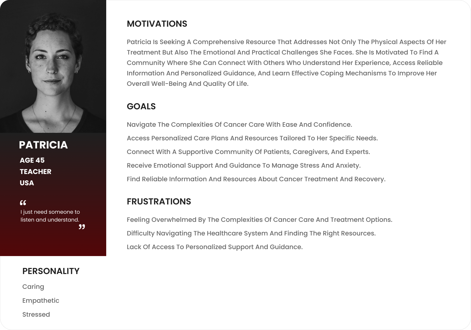
Patricia (The Patient)
- Motivation: Seeking a supportive community and reliable information to navigate her treatment journey.
- Frustration: Feeling overwhelmed by medical jargon and isolated from others.
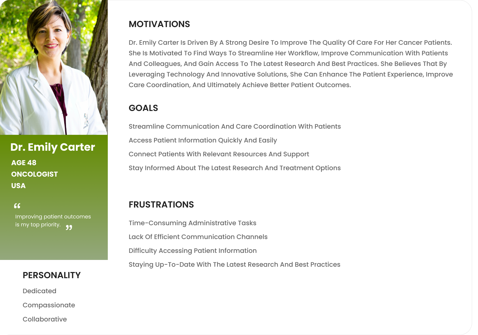
Dr. Carter (The Oncologist)
- Motivation: Improving patient outcomes by streamlining communication and providing access to the latest research and best practices.
- Frustration: Limited time and difficulty in coordinating with other care team members.
User Persona
Patricia is a cancer patient seeking a supportive community, reliable information, and personalized guidance to navigate her treatment journey. Dr. Emily Carter is an oncologist driven to improve patient outcomes by streamlining workflows, enhancing communication, and providing access to the latest research and best practices.
Collaborative Journey
This user journey explores the experiences of both cancer patients and their oncologists as they utilize the MHM platform to navigate the complexities of cancer care. It highlights how MHM facilitates communication, information sharing, and collaborative care between these key stakeholders.
| Stage | Action | Feelings & Thoughts | Pain Points | Opportunities |
|---|---|---|---|---|
Discovery & Onboarding |
Patricia:
Dr. Carter: |
Patricia:
Dr. Carter: |
Patricia:
Dr. Carter: |
Patricia:
Dr. Carter: |
Information Access & Utilization |
Patricia:
Dr. Carter: |
Patricia:
Dr. Carter: |
Patricia:
Dr. Carter: |
Patricia:
Dr. Carter: |
Community Engagement & Collaboration |
Patricia:
Dr. Carter: |
Patricia:
Dr. Carter: |
Patricia:
Dr. Carter: |
Patricia:
Dr. Carter: |
Ongoing Support & Personalization |
Patricia:
Dr. Carter: |
Patricia:
Dr. Carter: |
Patricia:
Dr. Carter: |
Patricia:
Dr. Carter: |
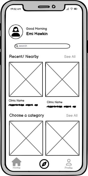
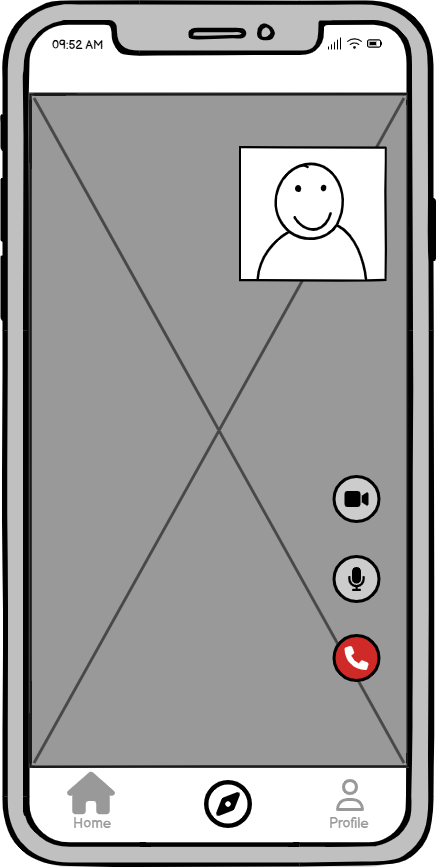
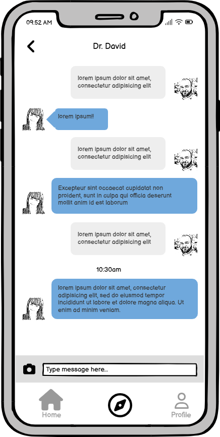
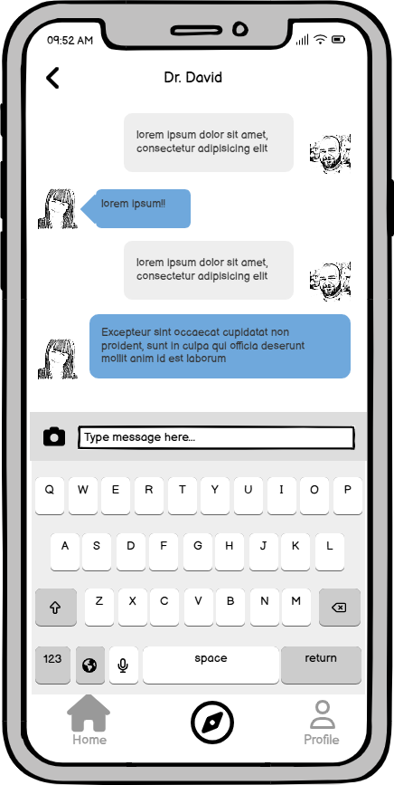
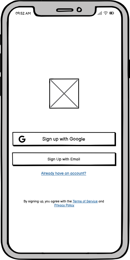
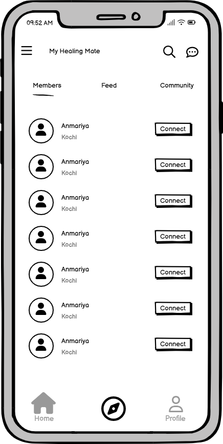
The Wireframes
Wireframing process involved iterative prototyping and testing to ensure the MHM platform met the needs of all users. This iterative approach led to a user-centered design that was both functional and intuitive.
Usability Testing
To ensure the MHM platform was intuitive, user-friendly, and met the needs of both patients and oncologists, a series of usability studies were conducted. These studies involved observing participants as they interacted with prototypes of the MHM platform, completing specific tasks, and providing feedback on their experience. The goal was to identify any usability issues and areas for improvement early in the design process and iterate on the design based on user feedback.
Participant Profile

Patricia
Age: 45
Gender: Female
Relevant Experience: Uses social media, some experience with health websites, but not a lot. Expressed feeling overwhelmed by technical jargon in the past.
Test Objectives
- Evaluate the ease of use of the onboarding process, specifically focusing on privacy concerns.
- Assess the findability of support resources and community forums.
- Observe user reactions to potentially stressful content (e.g., treatment side effects information).
- Understand the user's emotional response to the platform's design and messaging.
| Task# | Task Description | Success | Time on Task | Errors/Issues Encountered | Severity | Recommendations |
|---|---|---|---|---|---|---|
| 1 | Create an account and complete the onboarding. | Partial | 6 minutes | Hesitated at the privacy policy section. Expressed anxiety about sharing personal health information. Found the consent form confusing. | Medium | Simplify the privacy policy language. Highlight data security measures. Offer a "plain language" summary of the consent form. |
| 2 | Find the support forum for breast cancer patients. | Yes | 1 min 30 sec | Navigated directly to the community section, then used the filter option (positive). | Low | |
| 3 | Search for information on managing chemotherapy side effects. | N/A (Simulated) | 2 minutes | Participant typed in "chemo side effects" and expected relevant results. Expressed frustration when no results were displayed (due to prototype limitations). Indicated they would also search for "nausea," "vomiting," and "fatigue." | High | Improve search functionality to include a broader range of keywords and synonyms. Consider predictive search. Prototype Note: Search functionality was simulated in this test. |
| 4 | Read articles about coping with anxiety related to cancer treatment. | Yes | 5 minutes | Read several articles. Expressed feeling overwhelmed by the volume of information. Suggested a "summarize" feature would be helpful. | Medium | Offer content filtering and personalization based on user-selected topics. |
| 5 | Post a message in the support forum about feeling stressed. | Partial | 4 minutes | Successfully posted but expressed concern about visibility and potential judgment from others. Suggested anonymous posting option. | Medium | Implement clear community guidelines about respectful communication. Offer anonymous posting options for sensitive topics. |
Observations & Notes
- General Observations: Patricia seemed engaged with the platform's potential but also easily overwhelmed by the amount of information. Expressed a strong need for emotional support.
- Positive Feedback: Liked the clean design and the idea of personalized content.
- Negative Feedback: Search function needs improvement, concerned about privacy, and overwhelmed by information overload.
- Unexpected Behavior: Spent a lot of time browsing the community forum before completing other tasks, indicating a strong need for connection.
Summary of Findings
- Onboarding needs to address privacy concerns more directly.
- Search functionality needs significant improvement.
- Content filtering and personalization are crucial for managing information overload.
- Community features should offer more privacy and emphasize respectful communication.
What I Learned
This project was a profound learning experience, reinforcing several key principles that will guide my future work
The Power of Empathy
Understanding the emotional journey of users, especially in a sensitive context like healthcare, is critical. Design isn't just about pixels; it's about creating trust and a sense of safety. I learned to prioritize emotional needs above functional needs, which led to a more impactful and human-centered solution.
Iterative Testing is Non-Negotiable
Even seemingly small usability issues can have a disproportionate impact on a user's experience. Continuous testing and iteration are crucial for refining solutions. My usability test on the consent form proved that you must validate every part of the user's journey, even the parts that seem simple.
Bridging Design & Business
I learned that a designer's value is not just in creating beautiful screens, but in solving business problems. The MHM project reinforced the importance of linking design decisions to measurable metrics, like a higher user satisfaction score or increased engagement. This bridges the gap between design and business goals.
Thanks for watching
For more information or to discuss potential projects, please don't hesitate to reach out. I'm available to answer any questions you may have and explore opportunities to collaborate.