20% Faster Onboarding, 15% Improved Alert Response
I led the entire UX design process of Remotely Inc .This involved conducting user research to understand pain points, designing intuitive interfaces and information architecture, and validating the design through rigorous usability testing. I delivered user journey maps, wireframes, and high-fidelity prototypes, ensuring the redesigned platform met user needs and business objectives.

My Role
UX/UI Designer
Responsibilities
Visual Designing, User Research, Wireframing
Prototyping, HTML, CSS
Tools
Figma, FigJam, Balsamiq
The problem
Alert fatigue and a confusing interface crippled Remotely's security management. IT administrators struggled with overwhelming alerts and unclear data, which directly impacted their ability to respond to security threats effectively. They lacked a clear, actionable overview of their organisation's security posture.
The solution
I redesigned Remotely to prioritize critical alerts and provide clear, actionable insights. The new platform features intuitive dashboards and streamlined workflows, enabling IT teams to quickly understand and address security risks. This drastically improved the platform's usability and effectiveness.
User research
User research was a crucial component of the Remotely project. I conducted in-depth interviews with IT administrators, security professionals, and executives to gain a deep understanding of their needs,pain points,and expectations. Additionally, I analyzed user behavior data to identify common patterns and trends. Going into the research, I assumed that users primarily sought a platform to monitor security threats. However, through interviews, I discovered that users also valued features related to productivity, compliance, and data visualization. This highlighted the importance of a comprehensive approach that addressed multiple aspects of remote work management.
Pain point 1
“ Difficulty finding relevant information. “
To address this pain point, the design will prioritize clear information hierarchy, intuitive navigation, and powerful search functionality. By organizing information effectively and providing easy access to relevant data, users can quickly find what they need.
Pain point 2
“ Overwhelming amount
of data “
To mitigate this issue, the design will focus on data visualization techniques that present complex information in a digestible and actionable manner. By using clear graphs, charts, and other visual elements, users can easily understand and interpret data.
Pain point 3
“ Lack of clear visual cues “
To improve visual clarity and help users prioritize information, the design will incorporate strong visual cues, such as color coding, icons, and meaningful labels. These cues will guide users towards critical information and reduce cognitive load.
Pain point 4
“ Time-consuming tasks “
To streamline workflows and reduce the time required for common tasks, the design will focus on automation and efficiency. By automating repetitive tasks and providing shortcuts, users can save time and focus on more strategic activities.
User Persona
Sarah is a 28-year-old security analyst with a Bachelor's degree in Computer Science who lives in Chicago. She is part of a small family and enjoys spending time outdoors.

Sarah's Journey
I began by mapping Sarah's Remotely experience, identifying key pain points like complex onboarding and confusing security alerts. This information was then used to guide the design process, leading to a simplified onboarding wizard and a redesigned alert dashboard with clear visualizations and actionable insights.
| Stage | Action | Feelings & Thoughts | Pain Points | Opportunities |
|---|---|---|---|---|
Onboarding & Configuration |
|
|
|
|
Daily Usage & Monitoring |
|
|
|
|
Ongoing Management & Optimization |
|
|
|
|
Loyalty & Advocacy |
|
|
|
|
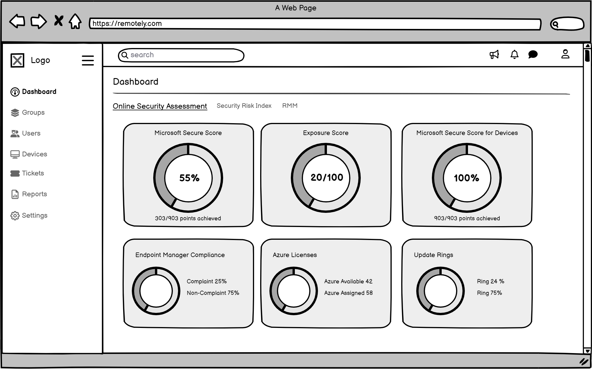
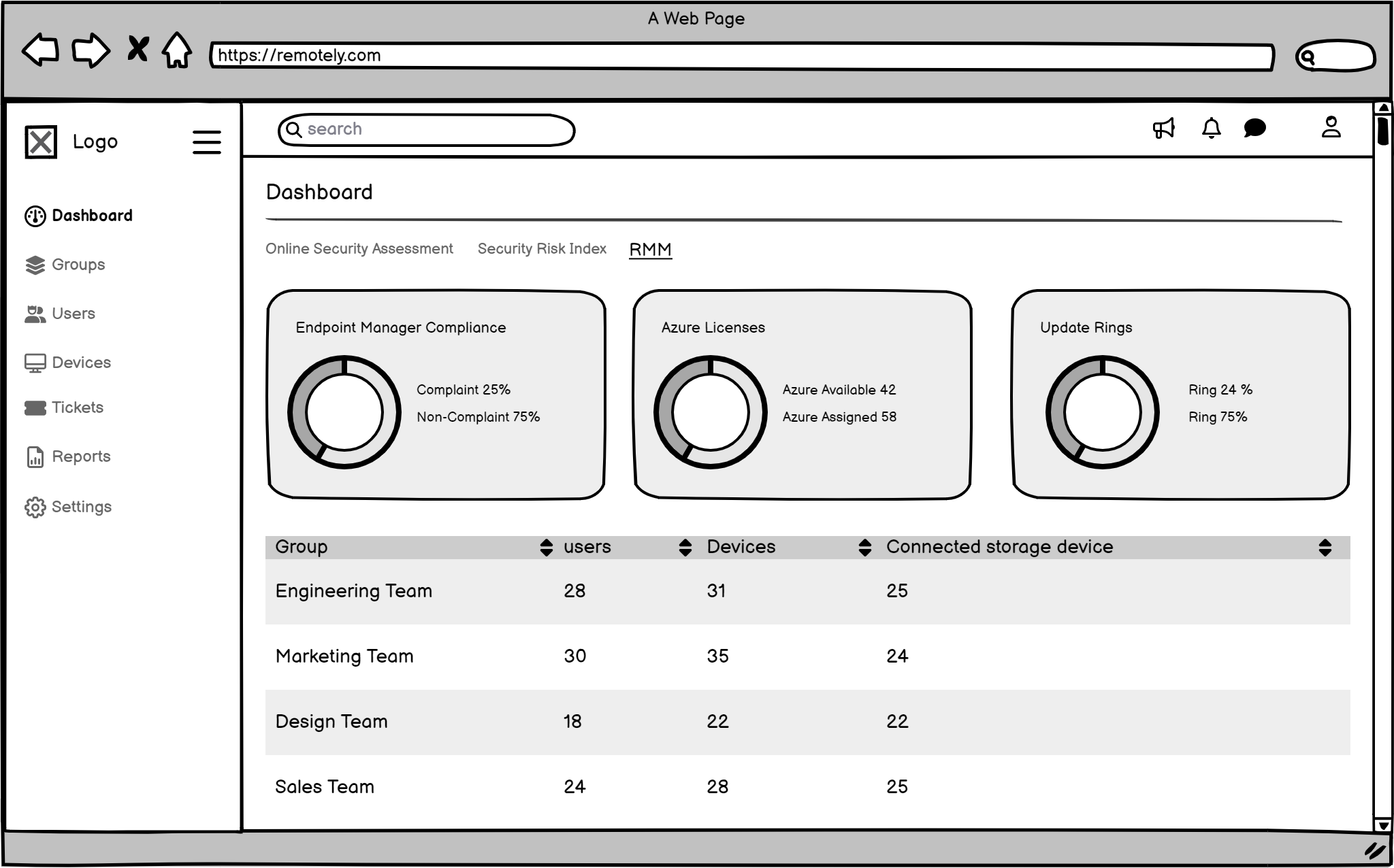
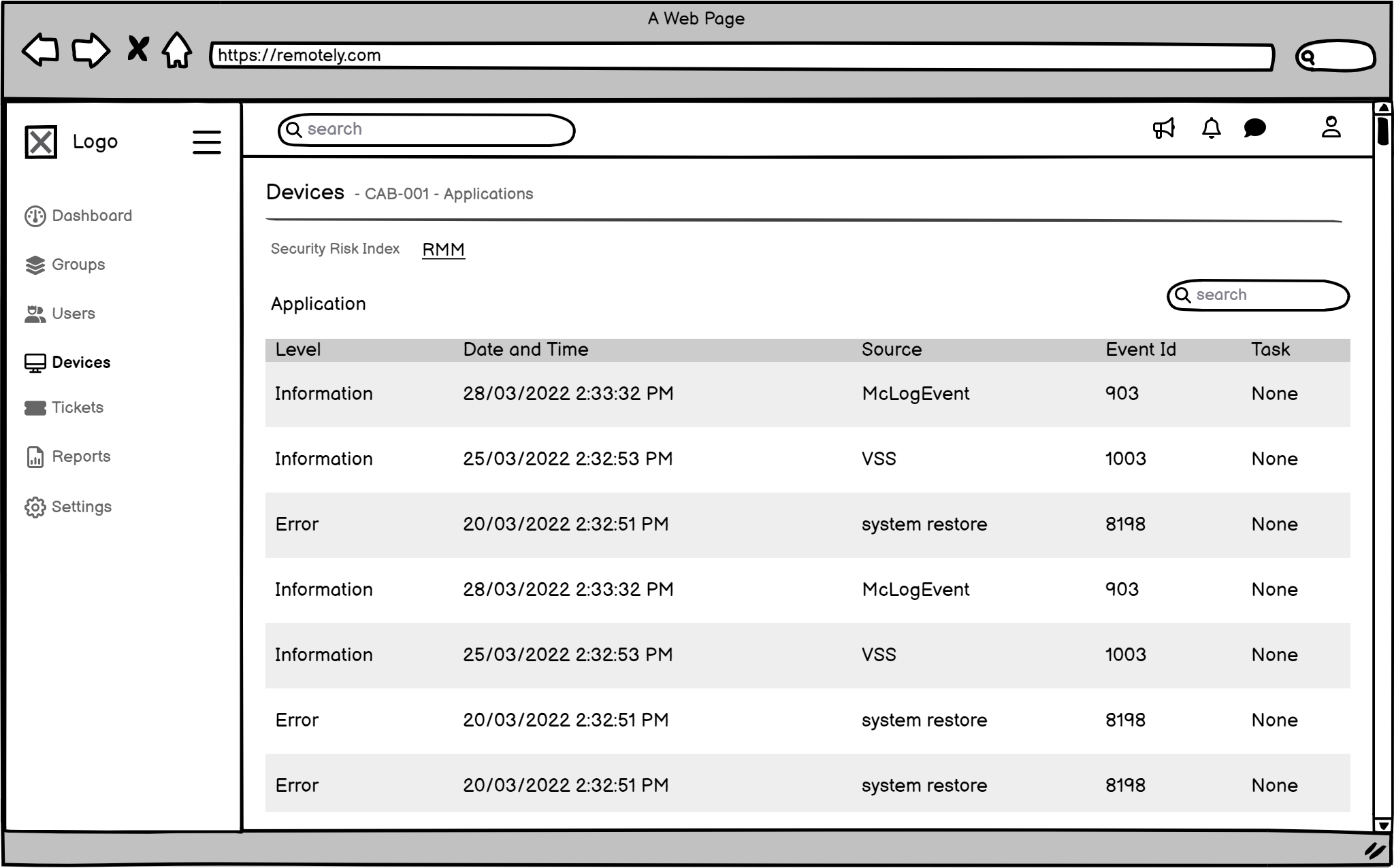
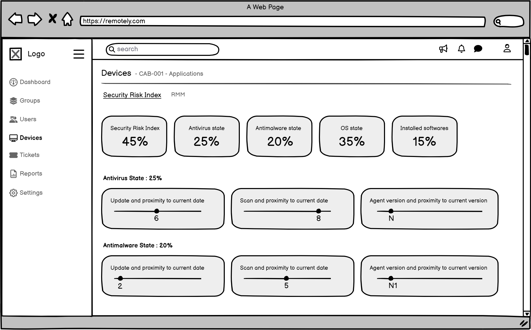
The Wireframes
To create effective wireframes , I focused on user-centered design, clarity, functionality, and visual hierarchy. Prioritize elements like a dashboard, alerts, data analysis tools, collaboration, and customization. Iterate and test to ensure the wireframes meet users needs and improve the Remotely platform.
Usability Testing
To validate our design decisions and ensure a user-centered experience, we conducted two rounds of usability studies. These studies involved observing participants as they interacted with the Remotely platform, completing key tasks, and providing feedback.
Participant Profile

Sarah Jones
Age: 28
Gender: Female
Occupation: Security Analyst
Company Size: Medium-sized company (500-1000 employees)
Device/Platform: Windows 11 Laptop
Testing Method: Figma Prototype Testing
Test Objectives
- Evaluate the usability and intuitiveness of the alert dashboard navigation and filtering options.
- Assess the ease of use and understandability of the policy configuration interface.
- Explore the user's experience and satisfaction with the visual representation of security data and reports.
- Simulate a security incident scenario and evaluate the user's ability to navigate the proposed response workflows within the prototype.
- Gather user feedback on the overall design aesthetic and its suitability for a security-focused application.
| Task# | Task Description | Success | Time on Task | Errors/Issues Encountered | Severity | Recommendations |
|---|---|---|---|---|---|---|
| 1 | Navigate the alert dashboard and attempt to filter alerts by severity (e.g., high, medium, low). | Partial | 2 min 30 sec | Difficulty finding the specific filtering options. Required assistance from the facilitator. | Medium | Improve the visibility and discoverability of filtering options on the alert dashboard. Consider using a more prominent UI element. |
| 2 | Investigate a simulated "Phishing Attack" alert within the prototype. | Partial | 4 min 15 sec | Unable to access detailed device information related to the alert. | High | Implement functionality to display detailed device information (e.g., device name, user location, OS version) within the alert details. |
| 3 | Attempt to configure a new policy to block access to social media sites during work hours. | Partial | 5 min 45 sec | Difficulty understanding the logic behind certain policy settings. Required clarification from the facilitator. | Medium | Enhance tooltips and provide more context for policy settings. Consider providing visual examples of policy configurations. |
| 4 | Explore the available reports (prototypes) and attempt to identify any potential trends or anomalies. | Yes | 3 min 15 sec | Positively received the visual representation of security data. Suggested the inclusion of interactive charts and graphs. | Low | Explore the feasibility of incorporating interactive data visualizations within the reports. |
| 5 | Provide overall feedback on the design aesthetic and usability of the prototype. | Yes | 2 minutes | Generally positive feedback on the overall design aesthetic. Suggested improvements to the color palette and font choices for better readability. | Low | Revise the color palette and font choices to enhance readability and visual appeal. |
Observations & Notes
- Positive Feedback: Sarah appreciated the platform's focus on a clean and modern design. She found the initial concept for the alert dashboard promising and expressed interest in its potential to improve security visibility.
- Concerns: Sarah expressed concern about the potential for alert fatigue and the need for more robust integration with existing security information and event management (SIEM) systems. She also suggested the need for more comprehensive training materials and ongoing support resources.
Summary of Findings
- The alert dashboard requires improvements in filtering, prioritization, and visualization to reduce alert fatigue and improve user efficiency.
- The policy configuration interface could benefit from additional tooltips, more intuitive navigation, and visual examples.
- While not directly testable in the prototype, seamless integration with existing IT infrastructure, particularly SIEM systems, will be crucial.
- The overall design aesthetic was generally well-received. However, minor improvements can be made to the color palette, font choices, and the visual representation of data.
Design Handoff
To ensure design consistency and streamline development, a comprehensive style guide was created. This style guide documented all the essential design elements, including typography, color palettes, spacing, and UI patterns. A well-organized component library was also created to promote reusability and efficiency.
-
Colors

-
Typography

-
Iconography

-
Grid Sysytem

-
Spacing

-
Text Fields

-
Selectors

-
Buttons

-
Elements

The Impact
The redesigned Remotely platform has received positive feedback from users, with many noting that it is easier to navigate, understand, and use. One user commented,
The new dashboard is much more intuitive and helps me identify potential security threats more quickly.
Sarah - Security Analyst
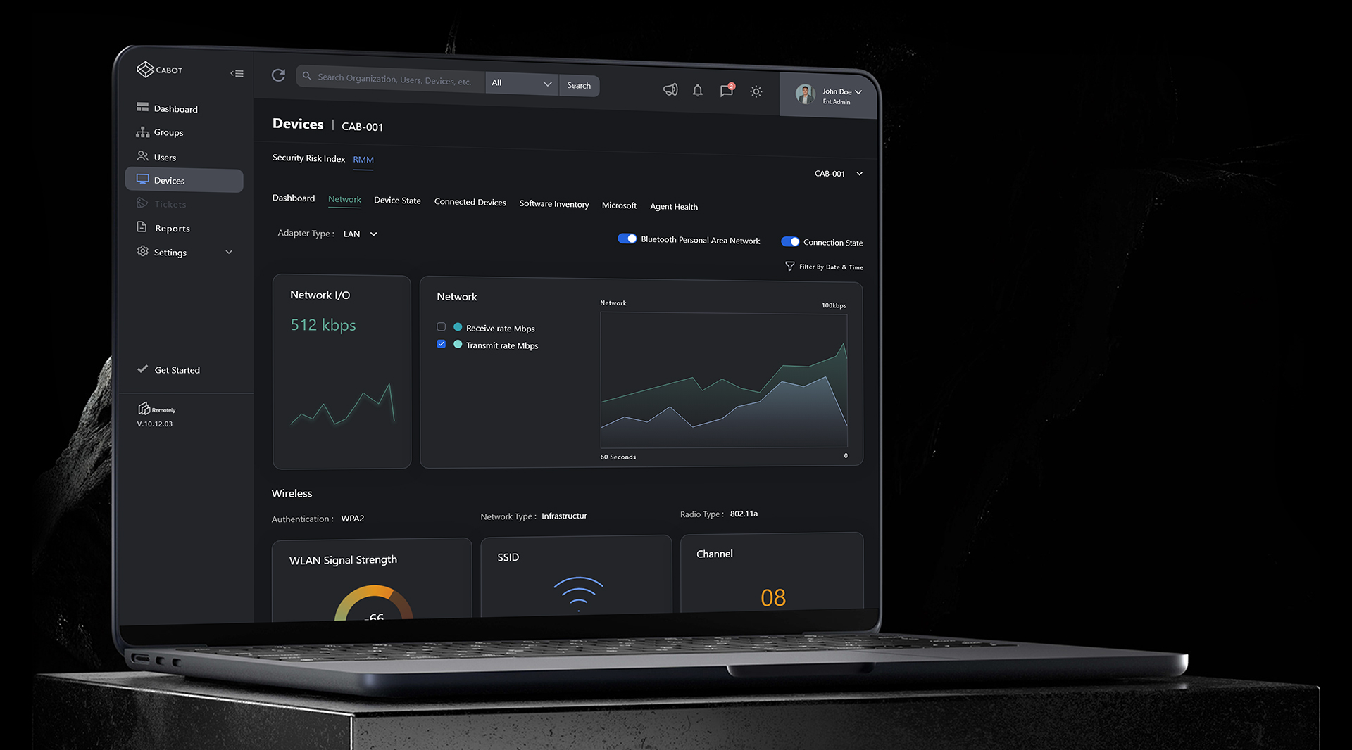
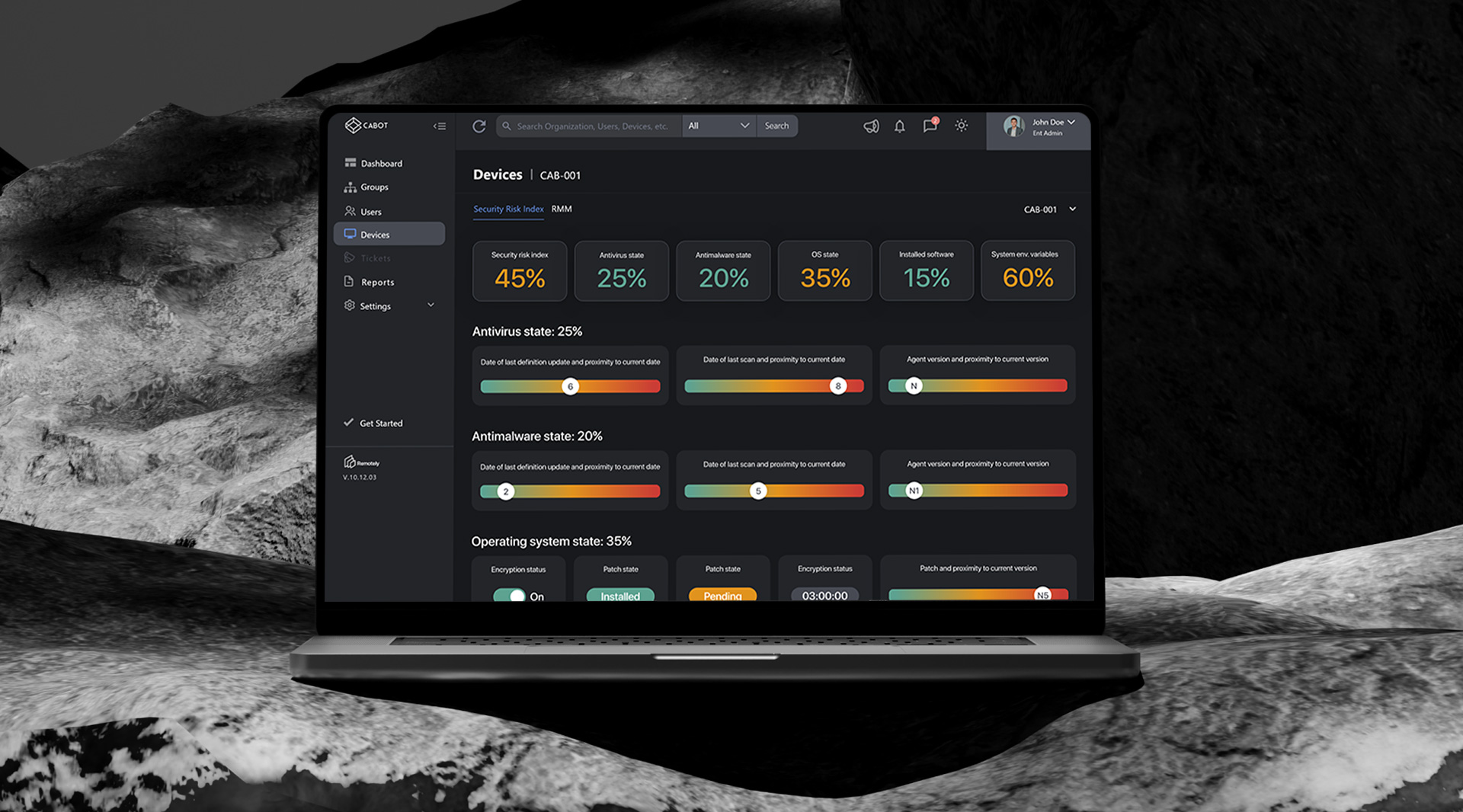
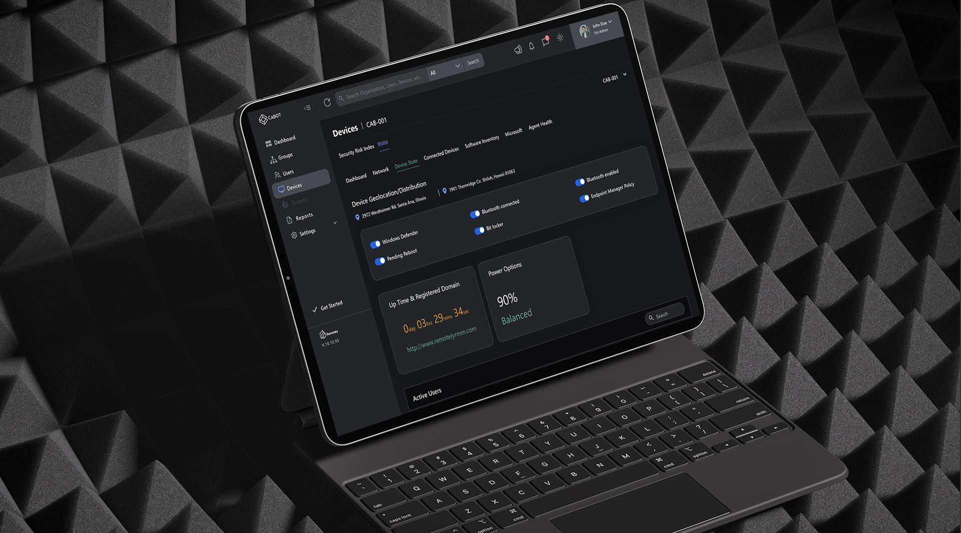
Data visualization
The design will focus on data visualization techniques that present complex information in a digestible and actionable manner. By using clear graphs, charts, and other visual elements, users can easily understand and interpret data.
Clarity Improved
To improve visual clarity and help users prioritize information, the design will incorporate strong visual cues, such as color coding, icons, and meaningful labels. These cues will guide users towards critical information and reduce cognitive load.
What I Learned
Throughout this project, I learned the importance of conducting thorough user research to understand the needs and pain points of target users. Additionally, I gained valuable experience in designing intuitive and user-friendly interfaces. Iterative design and continuous testing are essential for creating successful products that meet user expectations.
Thanks for watching
For more information or to discuss potential projects, please don't hesitate to reach out. I'm available to answer any questions you may have and explore opportunities to collaborate.